Product Redesign
A recent assignment through my academic program challenged me to take an everyday object and redesign it based on stakeholder research and user interviews. My goal was to identify existing problem areas and functional successes, and to re-evaluate the design to account for Value Sensitive Design and individual stakeholder needs. I aimed to prioritize intrinsic user values, and reduce existing barriers of access as much as possible
Redesigning the Medicine Blister Pack
Stakeholder 1:
Those With Physical Disabilities or Dexterity Challenges
Current Problem
Existing blister packs require dexterity, are difficult to open even with tools, and can be sharp or painful to those struggling with physical disabilities or dexterity problems like rheumatoid conditions.
In some countries, medicine in blister packaging is covered by primary insurance providers, while bottled versions are not, further limiting accessible options.
Current Successes
For those with physical disabilities, the individual compartments for medications are helpful because it reduces risk of spillage associated with boxed or bottled medications.
The clear dose dates and times on blister packs are also excellent for many, ensuring no missed medication dates/times, with tamper-evident packaging.
Product Values
Easy to open packaging
Individually packages pills
Easy medication tracking
Cheap / insured medication offerings
Independence/autonomy with medication usability
Stakeholder 2:
Parents or Caregivers of Young Children or Pets
Current Problem
Medicine blister packs are often prescribed in bright, colourful and crinkly packaging that could potentially attract kids or pets who might think it’s a toy.
The small, pliable packaging pieces or pills themselves could be a choking hazard for young children or pets who might chew or play with the package.
Current Successes
Individual dated dosage compartments ensure that if a child got ahold of a dose, it can be easily identified by the caregiver, allowing them to get medical attention sooner.
The difficult-to-open nature of these packages can be a good thing, since children would struggle more to accidentally get or consume the medication.
Product Values
Security and safety - easy to prevent kids from getting access
Discrete - not appealing to kids/pets, and not easily identifiable in public.
Portable - parents are always on the go and need something easy to grab + go.
Cohesive - something simple and functional that works with everyday life
The Redesign:
Before:
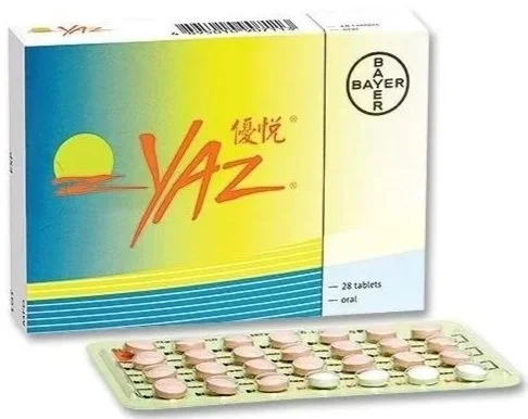
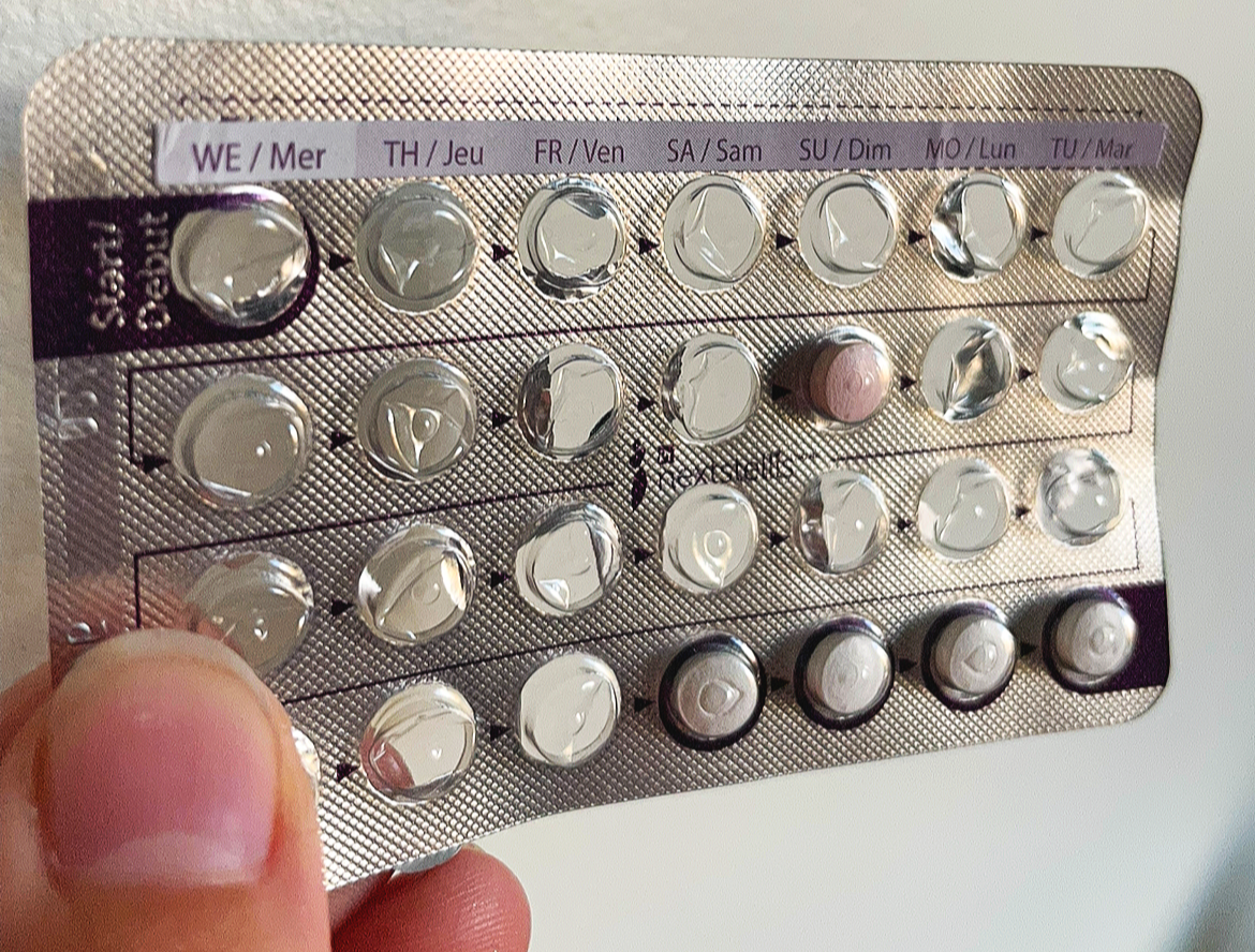
Sharp, pliable metal and plastic packaging with small individual compartments. Pills are popped out through the foil “blister”. Date stickers are placed along the top of the pack to identify daily medication doses. Bright and colourful packaging with colourful little pills are pretty standard.
Inaccessible - Choking Hazard - Attractive to Kids - Wasteful
After:
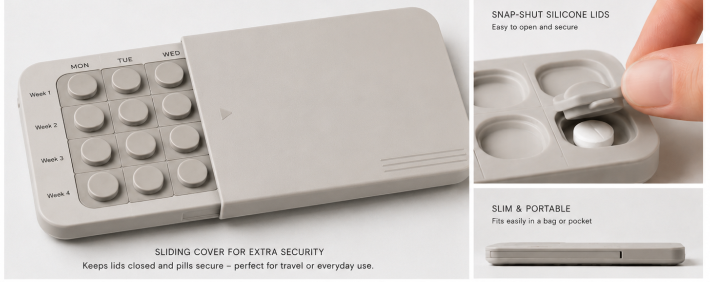
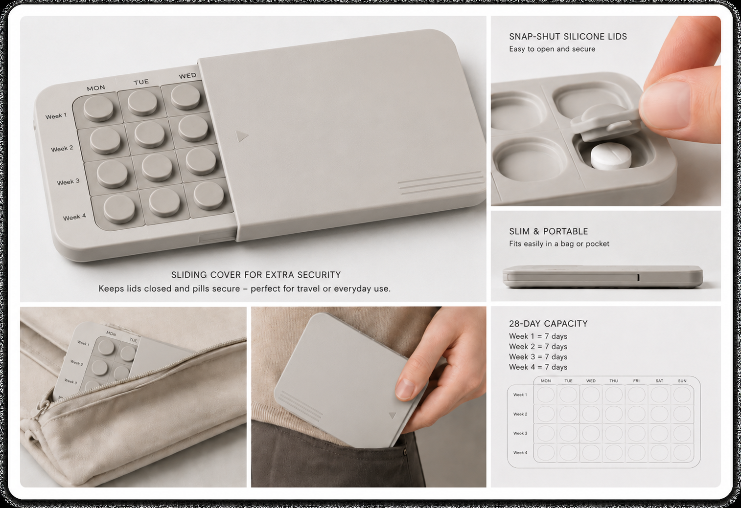
A sleek, solid plastic case with silicone snap-shut flaps for each individual dose. Easy to open with limited dexterity required, while maintaining easily identifiable dose days. The neutral colour palette and clean design are unattractive to kids, and discrete for public use. The slim, lightweight design makes it perfect for portability. The added sheath that slides over top adds an additional protective layer, preventing the caps from opening accidentally, and reducing any resemblance of the product to a kid’s toy.
The plastic cartridges are filled at the pharmacy. When picking up new prescriptions, users simply return the old containers to be sanitized and reused by the pharmacy. This reduces plastic waste, while providing all of the benefits of a traditional medicine blister pack without the headache. It’s an attractive product that users can feel safe and proud to use.
Accessible - Secure - Discrete - Stylish - Portable
Iterations
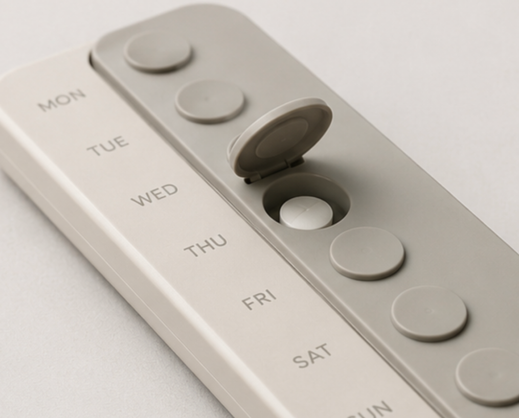
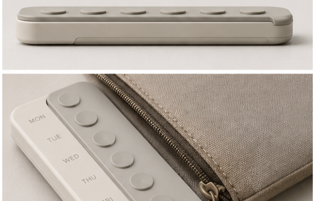
Version 1:
One week’s supply, initially meant to be travel or on-the-go focused.
User testing revealed concerns about one week’s worth being inconvenient for accessibility or long-term use. (Good for painkillers but not a daily medication).
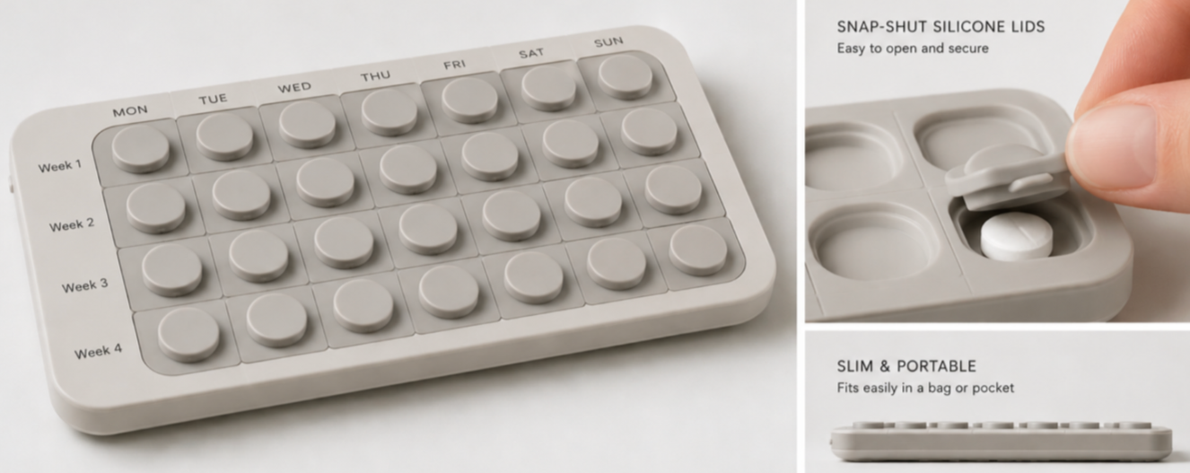
Version 2:
Incorporates a month’s supply instead of a week, lasting longer between refills.
Maintained the compact, pocket-sized design while incorporating 4 times the product quantity.
Users identified snap-shut lids would ensure doors won’t open by mistake.
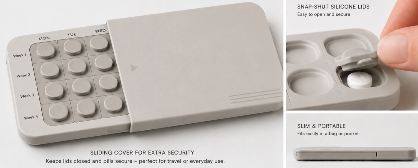
Version 3:
Added a plastic cover that serves as an extra safety layer
Someone in user testing said it looking like a pop-it or fidget toy could attract kids, and a plain cover would hide it
Some users in product testing were worried about the doors opening and spilling, so the cover prevents that.
Process Documentation
1: Research
I began by researching my identified stakeholders, and by gathering details on the intrinsic and extrinsic of those groups regarding the product.
2: Value Hierarchies
I then designed value hierarchies using a FigJam board, which allowed me to visualize and organize the priorities of each user value in the design process.
3: Product Iteration
Using Value Sensitive Design principles, I used carefully curated prompts to generate AI images of some potential product versions. I began with two initial versions as seen above.
4: User Testing
After developing a prototype that seemed to suit the outlined user values, I conducted user testing with people from my highlighted stakeholder groups to give their perspectives on how they’s use the product.
5: Final Product Iteration
Finally, I took the notes from user testing and applied them to create one final GenAI iteration of the product which included a “sheath” to improve the product security, reduce spillage risk, and deter kids.